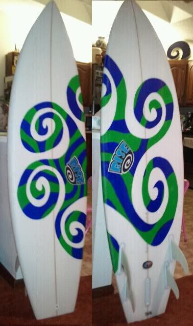
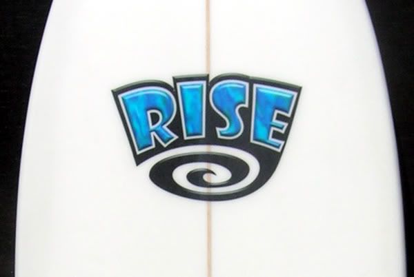
i’m trying to figure out what’ll work best for me to create logo artwork. a friend of mine does graphic design and was kind enough to vector an image for me and tweak it; but, i can’t go running to him everytime i want to print something out on rice paper. what do you guys use?
Photoshop Illustrator fireworks… I use all of them depending on what I am trying to do.
This is my logo. Feel free to use it.

Gimp 2, it’s a free download, but a bit of a challenge if you haven’t worked with programs like Photoshop. There is help on youtube of how to do specific things.
i have a mac so I use the free ones Gimp and Inkscape. The are limited but get the job done. Most valuable to me is my scanner/copier/printer. I 'll take my image, do a rough of it, scan it in and tweek it, print it back out, then use trace paper over to get a clean image then scan the final in.
…
…
My logo was made using free fonts from the following website which I arranged using Microsoft Word. http://www.1001freefonts.com/

pete - valid points. i definitely need to work on the important stuff…such as not burning through when you sand down the fin boxes and leash plug (hopefully that’ll come with time and experience). and i can see the beauty in a clean board done right. i don’t know though…i kinda like some of the artwork and ideas i can come up with to print out on rice paper. i see it as another extension of the creativity and personalizing the board for the friend or family member i’m gonna be making it for.
thanks for the tip though. i’ll definitely keep that in mind. what would you say is “the important stuff”?
cheers
jd
The cheapest, thinnest (lightest weight) printer paper you can find, put through an old school ink jet color printer. A laser printer will work, too. Just be sure to put down just enough resin underneath for it to fully laminate down… no extra… and pull out all the excess over top. There will be a slight bump around the perimeter, but a little extra resin over the area in the hotcoat, and careful sanding, will make it disappear.
Besides the computer, I’ve also used colored pencils and sharpies, but sharpies bleed and colored pencils don’t pop.
Have to agree with Huck on this one…screw the logo…
Apperantly, you shaped your first board sometime within the last year…good for you - you’ve cought the shaping bug…
When you can shape a board, yourself - and glass it, yourself - and polish it, yourself - and do all the other finesse steps involved - no stinking logos, maybe sign it inconspicuously with pencil along the stringer - and take it into a real surf shop and they’ll deem it good enough to put it in the rack for sale…
Then worry about how to create a logo…
Work on the important stuff first…
OK, I was kinda being tongue-in-cheek there. Not that I have anything against logos per se, for years I used to design logos professionally, and I still enjoy a well-designed graphic.

But I love the look of a board with no logos. To me, logos look so commercial, I just think its cool to celebrate the non-commercial aspect of building boards simply for the love of doing it, then personalizing it with some hand-drawn doodles, or a handwritten comment, instead of a computer generated graphic, which pretty much any monkey can do now with the programs out there.
My thinking is, why create a handcrafted one-of-a-kind labor of love, then make it look like it was commercially produced? I've had people come up to my board and say Wow, no logo - hmmmm. Yes, I am a backyard hack, a title I bear proudly LOL.
Yeah, everyone seems to do the logo thing, all the more reason for me not to! Just sharing a different viewpoint. I haven't really used my anti-logo logo on a board yet, but I do think it has a certain irony about it =)
Of course, for professional board builders, who are in this as a commercial venture, the importance of product branding is kinda mandatory in today's business environment, if you're doing this professionally then that's different.
I have a logo that I use on my foam boards… It is “BS” – a little biger - about 2" - but thats it. (My initials, btw.)
On my frist foam board, I drew it:
On my HWS boards, there are no logos nor are there any other markings on the board… Just my thing.
I usually try to intergrate my logo into whatever design i put on the board. I paintedone on the foam (first pic) and has a bit of a bumpy edge in places but i i’m happy with the result. I’ve inkjet printed one logo on rice paper (second pic) but those seem to fade pretty quick. I usually tape of, trace & cut out, and paint my logos on using whatever color scheme works with the design (third pic).
I created my logo in FlexiSign only because that’s what i use regularly at work. Illustrator is the only other vector program i use. Photoshop for the rest…
Painted on foam… (i originally wanted to do the letters orange for contrast but didn’t have any on hand while trying to finish the night before lamination)

Inkjet print on rice paper from photoshop…

Painted on glass pre-gloss coat…

I’ve only made a handful of boards and usually do something different on each. I dont really consider the logo necessary and mine isn’t really anything official other than an identifier that is unique to others.
Good luck! =)
If you experience the limits of gimp and inkscape, then you are a pro. These are very advanced applications!
I use Inkscape since it is vector based. Gimp or Photoshop are not suited to design logos since they are raster based.
I have a very old version of Corel draw that a graphic designer gave me. Ask you friend if he has any old programs that you could buy or even Amazon has cheaper/older software. Another one is Adobe Illustrator.
The point is to take time and learn how to do vector images. Sounds complicated but all the programs have tutorials that will give you the basics. The difference is that with a vector image, no matter how simple or complex it is, it will allow you to alter the image without losing any quality. If you decide to have a professional shop screen print your artwork it will be easier and cheaper to have them reproduce your image. If your sending them jpegs or font files, sometimes there will be charges to convert your image to a vector. Fonts aren’t usually too bad but abstract images with lots of detail and multiple colors can get expensive.
Why would you buy outdated stuff if there are magnificent free open source alternatives?
this thread has me laughing, hahaha
I always feel presumptuous putting a logo on my boards.
Especially the last one where I wrote “surfboards” hahaha.
I’m at number 6 or 7 I think =)
Oh well, I’ll keep putting them on really small. They mean something to me even if to noone else.
I built mine with the program that came with my last computer. Luckily, I saved a copy and just print one out
Whenever I need it… No more “surfboards” tho =)
Photoshop or Illustrator
100 DPI Minimum, 300 DPI is best
Inkjet Printer on logo ricepaper, normal quality setting (best quality puts too much ink on and you run the risk of smearing)
~Brian
