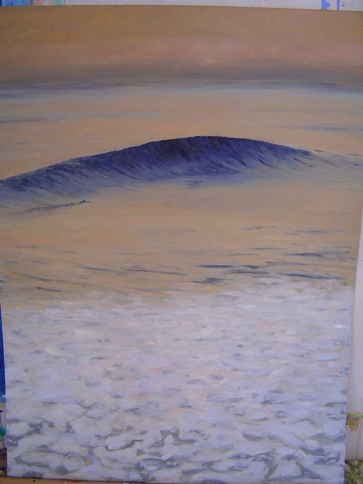
I thought I’s post some paintings I did when I was in Italy. I was jonesing hard for surf and so I started some paintings. I did a series without the board showing, because I figured in Italy they’d have more universal appeal, like a water dance or something. I ended giving a lot away. These are some I kept.
More. some of you will recognize the photos I used to paint from. If my memory serves me right “The second reef” was actually a photo of Brian Buckley (?) which was /is my all time favorite photo. In my painting the guy came out a lot darker, looks kind of kanaka.
I went to Cal State Long Beach, but I changed my major to art history after my first art class and saw works by Ad Reinhardt, Mark Rothko and Dan Flavin and I understood you cannot really teach art…
those are some great paintings – i recognized most of them frmo the pics, but you stylized them beautifully. the one of the guy lying on the beach staring out at the wave – that one was stored somewhere in some small, rusty, back-room file cabinet inside my brain. the first time i saw it it struck me - i never seen someone on the beach, lying that way checkin out the waves. very nice
I thought I’s post some paintings I did when I was in Italy. I was jonesing hard for surf and so I started some paintings. I did a series without the board showing, because I figured in Italy they’d have more universal appeal, like a water dance or something. I ended giving a lot away. These are some I kept.
It’s great to see this thread on your beautifull paintings! To me it’s a sign of a free mind. Keep them coming, and thanks!
Here’s what I’ve heard about coming up this summer in Laguna Beach.
Rick Griffin (1944-1991) was a renowned “surfer artist” when he arrived in San Francisco in 1966 just in time to earn a poster commission for the Human Be-In. Creating a simple, yet powerful design for that event, he quickly made a name for himself with his brilliant lettering, use of nineteenth century graphics, humorous approach to advertising motifs, and breathtaking color combinations. Rick’s most famous designs include “Flying Eyeball”, “Aoxomoxoa”, and “Heart and Torch”. Rick Griffin’s style reached maturity in the richly colored psychedelic dance posters he designed for Bill Graham’s Fillmore and Chet Helm’s Family Dog rock concerts. There has never been a museum exhibition of Rick Griffin’s work. The exhibit would include a survey of Griffin’s work spanning thirty years from the 1960s until his death in 1991. Curated by Laguna Art Museum chief curator, Tyler Stallings. Accompanied by a catalogue.
piggybacked with a new show by Reynolds Yater, Kevin Ancell, and John Comer. John Comer paintings of famous surfing locations will hang w/ well known surfboards that evolved from those breaks, replicated by Yater.
I went to Cal State Long Beach, but I changed my major to art history after my first art class and saw works by Ad Reinhardt, Mark Rothko and Dan Flavin and I understood you cannot really teach art…
Ironically I now teach art at a middle school.
A lot of Flavin I just can’t really deal with, although the color shift neon things around town here are really nice. There’s an installation that takes (took?) up a whole building that I always wished they would have done something else with.(http://menil.org/flavin.html)
I have a poster print of … wait a second… nope, couldn’t find it, but it’s a field of dark blue at the bottom and lighter blue in the top 75% of the frame–got it before I started surfboarding, but I like it better now
When I was in college I did an internship at MOCA (Museum of Contemporary Art. Los Angeles). I actually got to drive Dan Flavin around. I was thinking of doing a Masters degree at the time and asked his opinion and he said, “Don’t waste your time or money. They can’t teach you art! Do you think back in the early 60’s any art teacher would have told me to use flourescent light tubes to make art? Not a chance.”
I took his advice. Went and saw the world instead. I do like his art though. Some rooms feel like you’re swimming in color.
I also got to work for James Turrell. Jim is a consumate craftsman and his art blows me away. If you don’t know him check his work out. Jim, by the way, before he became famous as an artist used to restore old (cloth) airplanes and is passionate about gliders. He even bought a army surplus pressure suit because he wanted to get in the jetstream at 60,000-70,000 feet altitude and set the world glider distance record. the way he described it the jet stream is a cylindrical vortex and if you got on the right side (the side going up) you could ride it like angling down a wave. He was just missing one boot…
I know this is a surfboard design forum, but design and aesthetics, to me, are one and the same. Ever notice how things meant to go fast just look cool?
Turrell is my favorite artist, I think in the world. Ran across him by accident at a show at the Houston CAM. Adjectives don’t work. He has a permanent piece in the tunnel at the Houston MFA, and it’s pretty good but the works at that installation show and the works in his book(s) are beyond words for me. “Epic” maybe, but I feel stupid even trying. “sublime” I guess works.
Small photos online don’t even touch what it’s like to be in front of these pieces or inside them but anyway…
"Generally I would say that I make these spaces to capture and hold light. So I must use form, but I’m really involved in making architectural space. For me the form must become secondary. It’s nice to have a volcano because that’s going to be the form and that’s not something I made. But it also allows me to have many curvilinear spaces that are neutral. If I have a rectilinear space, as we have in this room and most rooms for the exhibition of art, and if I make an elliptical shape in those rectilinear rooms, it’s very strong because it’s no longer neutral in the rectilinear building. But our vision is not rectilinear, our vision is sort of two spheres together that actually make an ellipsoidal shaping of the perceptual field.
So if you create spaces that are rectilinear and still have them neutral in this very curvilinear, vluptuous earth form of the volcano in which all the forms are actually parabolic or elliptical. There’s one circular part, one crater that is actually within seven feet of being circular on a radius of 800 feet, 814 feet. It is within seven feet of being a perfect circle, which is amazing. This gives me a way to make curvilinear spaces neutral, whereas it is not quite as appropriate in museums and spaces that are rectilinear. The rectangle, sort of the slightly off square is much more neutral than is a circle or an ellipse in these situations. Otherwise it can become shaped canvases. When you come in you can see that there is a forming of form, but what becomes very positive is this thing in between the space, in the work that I do. At the crater I make an architecture of space and I use these forms to capture the light, to hold it, to, in a way, give it form, give it the space to reside. But it’s clear that it’s done so that it doesn’t reside on the wall. The light seems to fill the space. I think that that’s something you can feel. But it needs this architecture of form as well to capture light. Because I don’t want to take away from the form of this volcano, making everything underground avoids actually forming the outside of these spaces into a building. They are in fact built but they are underground so that the outside really continues to be the volcano. The reason that they are underground is partly for that fact, but more for the fact that I make light powerful by isolating it, and also that it is not very much light that I isolate. You may be looking at the light of Venus alone and you can see your shadow, just from the light of Venus alone, if you are dark-adapted for about an hour and a half. We see that well!
The reason I do this is that if you take your flash into a cave or a place that excludes all other light, it becomes quite powerful. So I need to have these spaces that are protected from other ambient light. I’m just taking the light from where I want it. So that’s why there is this underground architecture that in a way shares its outside form and opening with the bunker as in bunker architecture. Where the openings are made precisely, everything else is protected. In that way it also gives protection, it’s cool in the summer and actually somewhat warm in the winter. You can have places that capture and hold heat by being contained at the top and will become cold sinks by letting hot air go out and yet are shaded. This gives me a way to have a kind of a sparkling elegance in the human inhabiting of these spaces but it’s made primarily for the habitation of light. That is something we can walk through, even though all these sinks are completely open. That is, there is no glass: I can make the feeling of glass or the ending of the space quite easily, visually without having to do it with material. Everything is open, but at the same time it is protected, that’s why it’s underground.
This architecture, in terms of its form, shares similarity with the bunker architecture, in terms of its openings, except we’re not looking at fields of fire, we are looking up to certain portions of sky and protecting all else, and on the interior formed out in a way that it speaks of the naked eye observatory, say at Tycho Brahe or the work of the astronomer Jai Sing in Jaipur an Delhi. So it has that kind of design from the outside-in aspect and it does have an architecture of form which I utilise to capture the light and hold it, there by making a certain architecture of space.
I also pay attention to looking out from a space as in P.S.I Gallery’s ‘Meeting’ (1980-86, Long Island City, New York) so that there is not only accepting light in may be deeper space, but how the light is gathered as a quality when you are in the space and out of the space. So I’m trying to pay attention to those two qualities and in doing that in the outside form where architecture normally has it’s sense of style - I have nothing because that’s just the volcano."
This all seems to be of a piece with building surfboards to me–not watching certain rippers, but watching Yvon Chouinard on a wave at 67, or someone that is in tune.
I’m in total awe of your work - I love the idea of surf related art but when I see it I generally find it too illustration based. I think it’s so difficult to catch a moment that you don’t truely have a good grasp of in your own mind. I mean you can’t really stand back and inspect the view when it’s happening. Expressing the moment is a true skill and your paintings have it. They move me and I’m sure others too. They capture things that anyone who hasn’t experienced the feeling of riding a wave couldn’t possibly understand. Well done they are amazing…I’d love one at home myself as all I can ever manage is the typical illustration!